Booked The Expedition
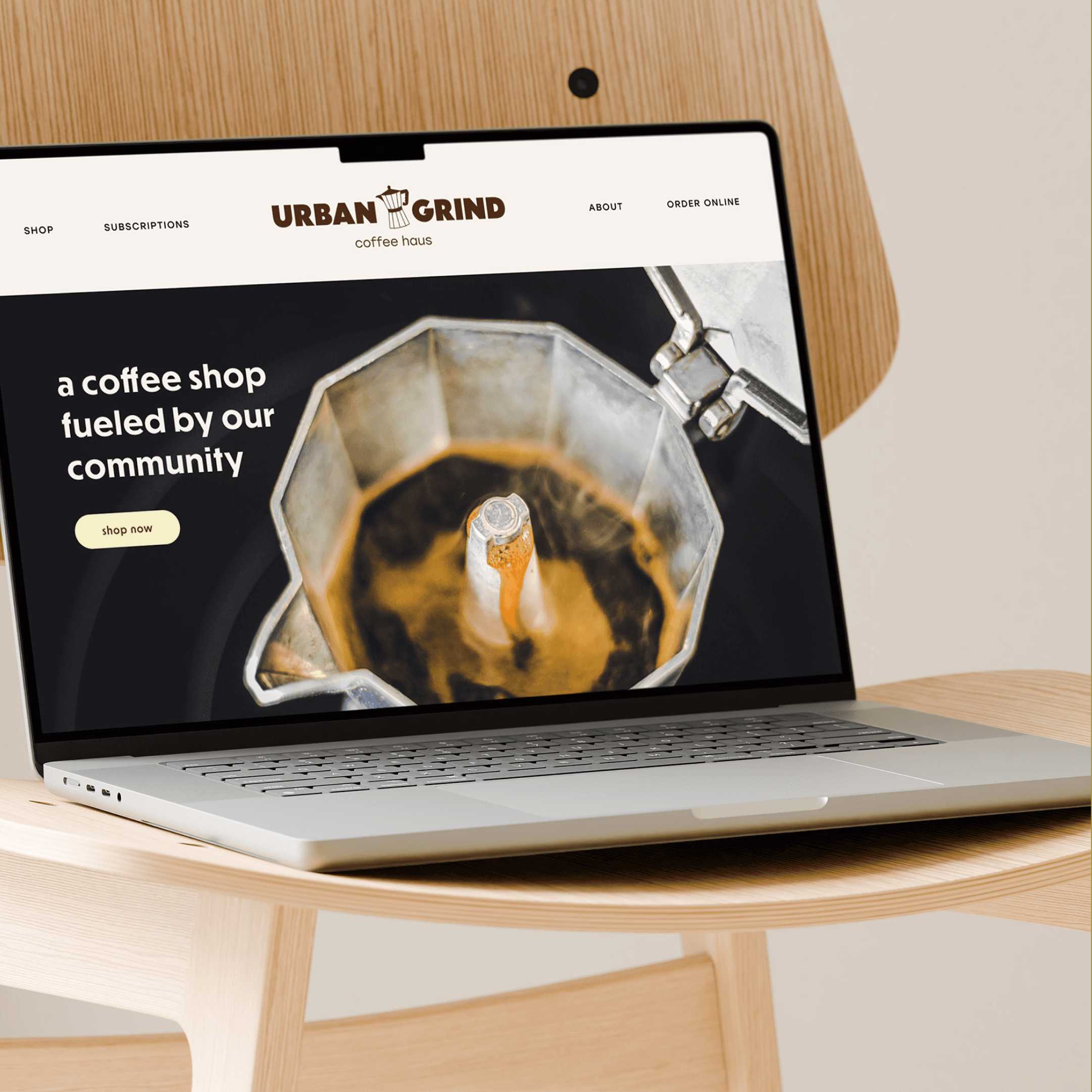
Urban Grind is a Bauhaus-inspired coffee shop where bold geometry meets your morning ritual. We crafted an identity built on clean lines, primary confidence, and form-follows-function thinking, a brand as structured as a well-pulled shot. Fueled by community, designed with intention.

Departure
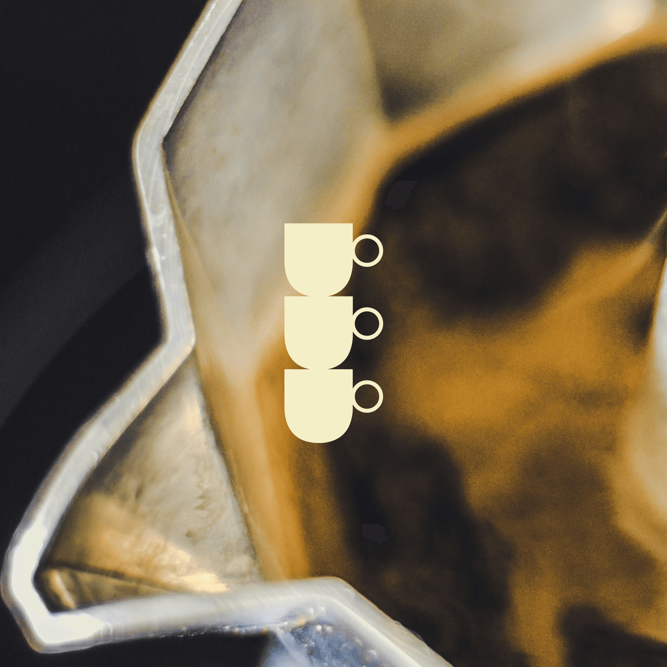
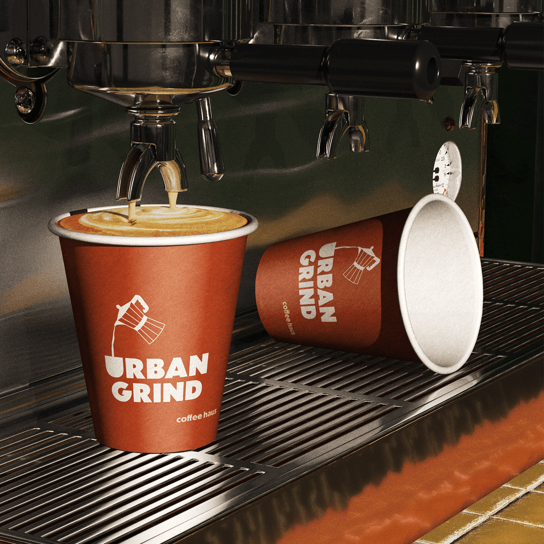
Urban Grind wanted a brand as bold as its roast: urban, warm, and unpretentious. Bauhaus gave us the geometry and the graphic confidence, but on its own it can read more design school than coffee shop, systematic where a cafe needs to feel human. So we kept the bold lines and warmed them two ways: a palette pulled from the cup, espresso, cream, and acidity, and a hand-drawn moka pot that puts a retro mark against the grid.

Arrival
From there, every piece composed into one grounded system: logo, packaging, and website, all built on the same clean lines but never cold, a neighborhood favorite instead of a chain. Urban Grind walked out with a brand that's balanced, intentional, and as inviting as the smell of a fresh pot.